My ideal aesthetics for my brand are inspired by the visual snow and migraines that i not only experience but see in my everyday life. This completely changes my perception of how i view the world and i want to get that across accurately and express what i see and the auras i feel through the aesthetics of my branding and collections.
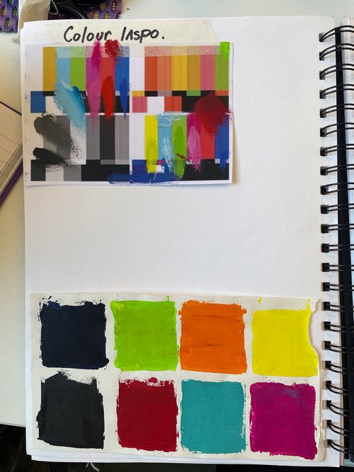
The closest i can explain my visual snow as is the static on a TV, But also tv signals and glitching relates so closely to my experience with migraines and the patterns i see when i close my eyes. The colours themselves are the most vivid and bright colours which merge, flash and interact with each other.
These colours are a lot more noticeable to me in the dark or with my eyes closed. Meaning in the dark i actually find it hard to see anything that is really there. This black background creates the perfect canvas for me to really see what my eyes and mind are processing. It makes the colours so powerful, this is something i really want to portray properly through my branding.
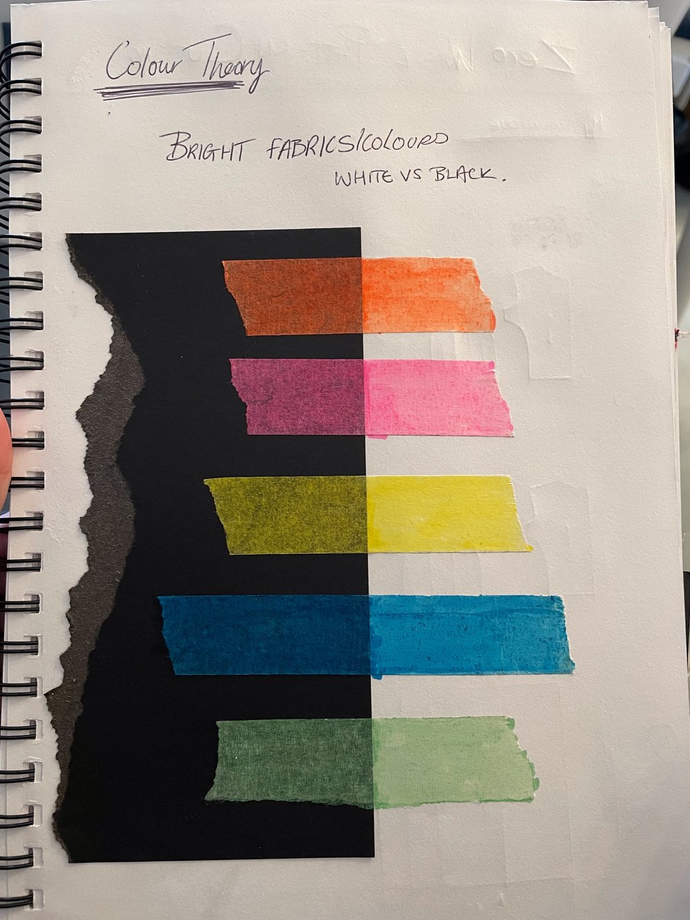
Through my sketchbook i tested how certain bright colours look when contrasted against white and black. I have tried to prove how bold the colours look when contrasted against the black. On the white background the colours look bright, however they create a feeling of daylight, happiness, naivety. A bright look of optimism and joy is as far from the experience i want to create through my brand. My Migraines and visual snow are a visual disturbance, an irritable view of the world which is both painful and a nuisance. I need to capture that fully through my colour palette in which will be part of my branding pack, ensuring every element in my branding connects and is recognisable. This will also be the general colour palette throughout my designs. Whilst i recognise my concepts for my collections will change over time, meaning colours will never be set in stone, instead develop for each collection. I think the basis behind the colour theory will stay the same. The use of mostly black in my designs will set the undertones for my branding in each collection. The black will make any colours used stand out in a way that will highlight the shapes, seams and patterns in which the colour appears. Especially when used against dark backgrounds for runways, photography and styling, which will create an overall experience of what my migraines and visual disturbance is.
Colour is so important in every aspect of design. By researching more into colour theory and the moods they create it can set a tone for the branding and the collections. For me it is so important that the collections have a very strong sense of branding and for me i would like to tie this together through colours. Although the colours are not the only thing that will make my designs recognisably Melissa-Kate Studio, the other aspects in my designs will come after years of research, development and collections, seeing what’s working and selling.
I want to buy and read a book called The Colour Code by Paul Simpson. It is a psychological insight to why colours make humans react in certain ways and the history behind this. For me this is something i need to be aware of constantly in my practice as creating a sense of feeling is a large part of how i want my designs to be impactful.